Paint Color Trends of 2023
Today I’m sharing the top interior paint colors and trends of 2023. Also, as a bonus, I’ll be sharing our designer tricks for choosing the right paint color Every. Single. Time. These are so good, so let’s dive into the first 2023 Paint Trend!
Paint Trend #1: Warm Neutrals
Gone are the days of cold whites and grays; warm neutrals are on the rise, and I’m on the bandwagon.
These easy-on-the-eyes colors are soft and welcoming and pair well with every design style.
We are seeing a shift to warm neutrals being the foundation of a color palette, with walls, ceilings, and millwork in various tones and shades of this trend.
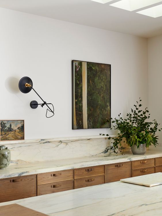
A few of our favorites are Collingwood, Edgecomb Gray, and Pale Oak. Which is a personal favorite and the color I used in our primary bathroom. All these colors are from Benjamin Moore.

From Sherwin Williams, we like Shiitake, Neutral Ground, and Balanced Beige. We recently used this color palette in one of our custom design + build projects.
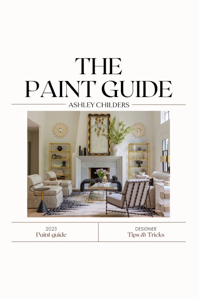
If you want access to these Warm Neutral paint colors and all our other favorites, click on the paint guide cover.
We’ve created a free comprehensive paint guide for y’all, where we share all our favorite paint colors and combinations; it’s like the holy grail of paint guides, so make sure to grab yours!
Trend #2: Umber Undertones
This paint trend is gaining steam and is the perfect counterpart to the 2023 paint trend of warm neutrals.
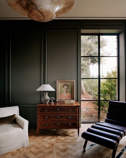
Umber Undertones is all about deeper colors that have a warm brown as their undertone.
They can range in colors from warm greens to reddish browns and even deep burnt oranges and are all part of naturally derived earth pigments.
These deep, warm colors are perfect for adding depth and drama to a room.
We love layering different colors in the Umber Undertones palette to create a layered natural interior. We have a few favorite paint colors in the Umber Undertones trends. They are Charleston Brown, Coffeehouse Chocolate, and Satchel from Benjamin Moore.

And Aurora Brown, Umber Rust, and Redend Point are the Sherwin Williams 2023 color of the year. I love how the Umber Undertone trend is really warming up interior spaces. By bringing color and depth to a room. And I’m in the process of adding one of these beautiful rich colors to the walls of our primary bedroom.
Paint Trend #3: Soft Pastels
Soft pastels are on the rise, and we’re seeing more and more of them popping up in common spaces and larger open-concept areas of homes.
I love the calm, welcoming glow that soft pastels create, and we’re embracing them on walls, millwork, and cabinetry.
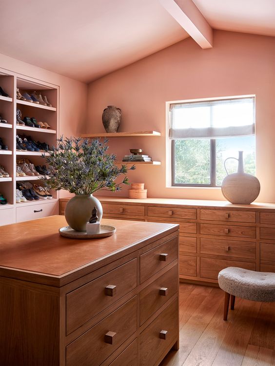
The Soft Pastels that we’re currently crushing on are First Light, Wind Chime, and New Age by Benjamin Moore. Plus, Sherwin Williams Rainsong, Radiant Dawn, and Minute Mauve. Of which we just used on all the cabinetry and trim of a fun laundry room at a recent project.

Trend #4: Jewel Tones
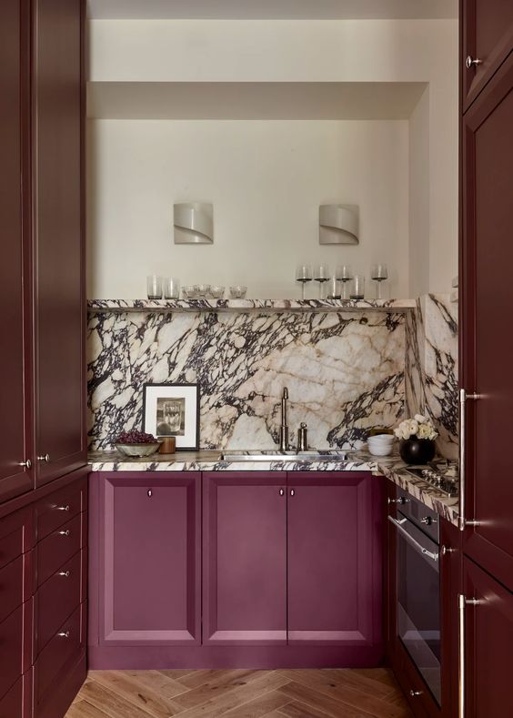
The Jewel Tone paint trend is coming in hot y’all, and we’re seeing these rich, saturated colors popping up everywhere.
I love how these colors bring vibrance and energy to a space and can create a dramatic envelope for more paired-back modern furnishings and décor.
Our favorite Jewel Tones for 2023 are Benjamin Moore’s Hale Navy, Miramichi, and Carter Plum. And Burgundy, Mountain Fig, and Dark Knight from Sherwin Williams. These colors are rich, vibrant, and dramatic.

Paint Trend #5: Dark and Moody
We have seen a major shift in interior colors over the last year, and this trend is being embraced wholeheartedly.
So we are sharing our very favorite Dark and Moody colors to get you going in the right direction.
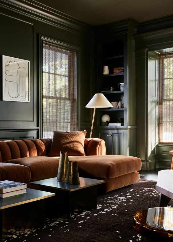
We are loving Southern Vine, Stone Cutter, and Townsend Harbor Brown from Benjamin Moore. And Bitter Chocolate, Sea Mariner, and Tungsten from Sherwin Williams.

How to Choose Paint
When choosing paint colors for a room, it’s very helpful to first line up the samples on a white background. Use a piece of paper so that you can compare the colors side by side. Once you’ve narrowed it down to 3 or 4 colors, get small sample pots of those colors.
Then paint large squares on a white poster board. We do this first instead of painting the color options directly on the wall. It’s helpful because, depending on the wall’s current color, it can drastically affect how the new paint options read. You want to get a true color reading for the samples; therefore, comparing them in the space but on a white background is very helpful.
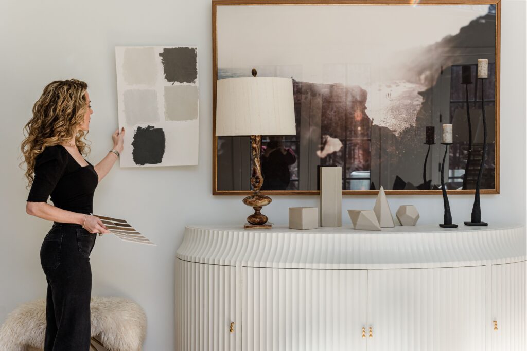
Next, look at that posterboard in various places within the room and at different parts of the day to get a real picture of how the color will read in the space.
This step is paramount in discerning the undertones of each option. And can help you quickly eliminate some of the colors based on the overall undertones you see. Take my word for it; follow those tips, and you’ll be picking paints like a pro!
Watch the full YouTube video and see our Paint Trends Pinterest board below.
Top Interior Paint Colors for 2023 YouTube Video
Interior Paint Colors for 2023 Pinterest Board
As Always, Thank you for reading, and remember, good design is for everyone. So grab a paintbrush, put some color on your walls, and love where you live in 2023.
XO, Ashley
get the paint guide
Take the guess work out of picking paint colors with our pro paint guide! We're sharing all our favorite colors and our very best designer tips to help you choose the right color every time.
get the guide
Paint
colors
the 2024 best
watch our channel
Looking for design inspiration, pro tips and some of
our favorite resources? Join us on YouTube to get weekly style recommendations, expert design advice, and entertaining ideas.